Saturday, October 28, 2023
1981 WCLH Playoffs
Saturday, October 21, 2023
1980-81 WCLH Season
The Lethbridge Cougars are celebrating a milestone 75th anniversary. To celebrate this season, the team lifted banners of retired numbers worn by some Cougars greats, including Cliff Burns and his number 25, up to the rafters. On their home opener, they took the win in a big way over the Saskatoon Cats 8-2. After their home opener, they kept on the gas as they won 36 of 50 games to finished 1st in the west and the league.
The Abbotsford Forest Kings opened their home game with the rising of the 1980 Jade Trophy banner and the CIHA Valor Cup banner. As fans have a good reason to be excited for this year as both Ed Bram and Luke White will play their final season before they will be eligible for the 1981 Pro Hockey Draft. Both combine 78 points to help the Forest Kings stay in the top 2 in the west division.
The Billings Trains took a mid-season gamble by trading their last 4 round picks (2nd, 3rd, 4th, and 5th) to the Fargo Owls for forward Jack Clarke, and it worked for them as Jack made 23 goals and 56 points, leading the Trains to finished 3rd in the west and making to their 1st playoff in team history.
Moose Jaws took a lot of criticism for wearing white pants to their classic set, so much so that there are talks that both League President James Name and other owners are considering putting a ban on any teams that thinks about wearing white pants down the road. Despite all the white pants fiasco, the Wings took it as fuel as they won 12 of the last 20 games to finished 4th and headed to the playoffs for the 5th year in a row.
Even though Juuso Heinola's scoring improved more than his previous season to even win the league scoring title, it didn't help the Nanaimo Sharks this season as they once were playoffs contenders, now being the tanker, they lost a good number of players during the off-season. In the end, they finished 5th.
The Medicine Hat Hawks had some promising young talent, but they finished the season with only 9 wins landing them in last place in the west.
Kenora Pioneers had a rough start by losing 9 of their first 15 games; after that, they turned it around by winning 16 of the last 20 games to finished 1st in the big east thanks to rookie goalie Luke Hay as he won 10 out of 15 games and letting in just 16 goals and got just 1 shutout.
With the record of 27-20-3, 57 points gave the Swift Current Battalion a 2nd place finish and will go to the playoffs for the first time since 1976 when they were the North Battleford Crusaders.
Last season the Portage la Prairie Magic had a magical 4th place finish, led by Matthew Atlas and rookie Zachary Natyshak with a combined total of 46 goals and 97 points, giving them a 3rd place finish with 24 wins, 19 losses, 7 ties, and 55 points. Zachary Natyshak was a big surprise in the WCLH as the top rookie, many critics believed that he would not even be in the top 10, but as the season ended, Zachary won the rookie of the year award and caught many eyes of many pro hockey scouts.
The 1980-81 season would be what many fans believe to be the last shot for the Brandon Buffalos, with 8 players on their roster overaged. If they failed to do so, they would have to rebuild the team painfully; possibly, the only team that is keeping them from clinching 4th place is the Fargo Owls. Both were neck and neck until the final 5 games. The Buffalos won 3 while the Owls won only 1 game; as the season ended, the Buffalos took 4th place and headed to the playoffs, for the Owls finished 5th, meaning the first time in team history that they missed the playoffs.
The 1980-81 season was not so friendly for the Saskatoon Cats as they finished last overall with winning just 7 games, 3 wins less than their 1960-61 season (pre-CIHA era) 5 years before Stan Jones handed the ownership to his son Rick which he went on and turn the team around. Things are about to get more difficult for the Cats as Edward Gore resigns as head coach after 16 years with the club; the team will name a new head coach after the off-season.
Saturday, October 14, 2023
CIHA Jerseys reveal
Many fans at the Valor Star Tournament in Ottawa saw new uniform sets for all teams, including two new teams in the OMJHA, all made by KI-LO. Some got new jerseys design, while a few just got logo updates to have brand-new logos. Only 13 teams carried their current design over to the KI-LO jersey system.
For the first time in the team's history, the home and road jerseys have the same design; the road is the same, while on the home jersey, the sleeve numbers are now white with orange trim.
The Les Rouges went back in time as their set is based on their glory days in the old Quebec Junior Hockey League. On this set are simple stripes with oversized cuffs; the TV numbers sit on the shoulders because the stripes take the whole arms.
Their uniforms are still the same, but their updated logo became the talk. The Viking helmet on the home is purple with orange "V" and white "F" as the horns are white. On the road, the helmet is white with an orange "V," and the "F" is silver.
The stripes on the arms are thinner, just enough for the TV numbers to move from the shoulders to the arms.
The Bears showed off their updated logo, replacing the pentagon around the paw with a nameplate that says "BEARS" with thick trims around the logo. They also add a logo (minus the nameplate and wide trims) on the shoulders.
The arms, hem and socks got thick stripes and thin trim stripes. The logo gains a trim around it. The numbers on both now got two trims around it.
The Loups introduced their new logo with the team playing in a brand-new arena. A circle logo with a wolf paw and a moon with the letter "S" on it. The jersey design is the same, but the stripe on the arms is now straight.
The Titans add a small "T" on top of the big "T" logo to represent their 1976-77 CIHA Valor Cup championship. The home jersey has three thick stripes with two thin strips together, while the road has just two stripes and no sign of white whatsoever.
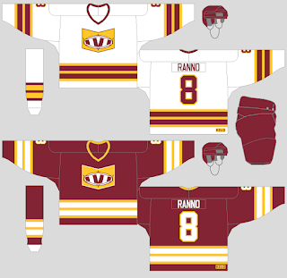
The home and road jerseys have the same stripes design, but it has no yokes, the collars have only one colour, and both maroon and gold on the stripes switched roles.
Next is the OMJHA to show off. With the league now at 14 teams, only 6 teams (Barrie, Legionnaires, Oakville, Orangeville, Owen Sound and Waterloo) kept their set the same while the rest showed off their new look.
The stripes on the arms and hem are a little thinner, the TV numbers are moved from the shoulders to the sleeves, and the primary logo has a thick trim around it.
Burlington showed off their new logo featuring a building behind the "METROS" wordmark. One tower got two hockey sticks, and the other got numbers (2,3 and 6) that are a nod to the first 3 stars Patrick William (2,) Chris Petersons (3,) and Joe Tilburg (6), who were part of the back-to-back Smyth Cup run and the trio went on to a so-far successful run in the pros. The jersey designs got no yokes and added grey to the stripes. The numbers changed to a different font with a trim and a drop shadow trim to go with it.
Both Jerseys got a cuff stripe along with a stripe on the socks. The road jersey no longer got a white yoke, but the collar is now white.
The logo had thick trim around it with red and gold only, and it would switch roles on both home and road. The home jersey is the same, but the numbers no longer got trimmed around it. The road has no sign of white whatsoever. The pants just got two thin gold stripes.
The arms, hem, and socks on home would have three stripes, just like the road jersey.
The Braves set got simple stripes on the arms, hem, and socks. The numbers and the nameplate are blue with red trim, while on the road, the nameplate is gold with red trim, and the numbers are red with gold trim. The road jersey got a red yoke and gold collar; as for the home jersey, no sign of colour on the yoke, but the collar is blue.
The logo is based on a front grill from Hornet Motors' top-selling car, the "Shark," but it is hockey sticks instead of shark fins on top of the grill. The jersey colours are classy navy blue, silver, and gold.
The big "N" with neon colours around it as trim is the team's logo. On the home, it got a big black stripe with thin neon colours inside the stripe. The road jersey's neon colours (including white) stripes are thicker. The most out of the box on this jersey are the colours for the numbers; on the one arm, the numbers are neon green, the other arm is neon pink, and the number on the back is neon yellow.
The 1980 Valor Cup champions had changed their look not too much. The stripes changed on both home and road, the current logo gained a trim so fans can see it better, the pants are now black, and finally, on the road, numbers are black with white and gold trims, unlike their previous road was white with black and gold trims.
The Buffalos introduce their new logo, and the helmets are now white for both home and road. The jerseys got a thick stripe and two thin trims on the arms, the hem, and the socks.
The Fargo Owls were among many that made the most significant change to their look. Black is nowhere to be seen. The brown is darker, and the orange is slightly brighter. The new logo is a giant "F" with the name and an owl sitting inside of it. The Jersey design is still the same but just brown and orange, the pants are brown with orange stripes, and the helmets are orange.
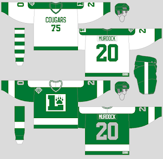
For only the 1980-81 season, the Cougars will wear special jerseys for this occasion as part of the 75th anniversary. The home jersey, the team, paid homage to their first-ever season in 1905 with the word "Cougars" across the number "75" under it. The road jersey is based on their first season as part of the WCLH, but instead of the wordmark, it is the team's current logo, with the numbers being silver.
The Hawks got a simple change as the arms, hem, and socks got two stripes; the rest is still the same.
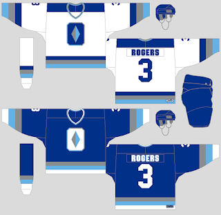
The jerseys are still the same, but the helmets are now white, and the one thing that everyone is talking about is the pants are now white with red and blue stripes; there are many questions about the move, and even James Name is not a big fan of white pants and hopes that it will change very soon.
The logo is updated by replacing the "HC" with the letter "N" on the background behind the "SHARKS" wordmark. Simple straight stripes on the arms, hem, and socks. The colours are the same, but the black is dropped for now.
The biggest questions made by many about the Cats rebrand is the logo, which is a smiling cat missing some teeth and a big black eye, the secondary logo is the same, but the face is replaced with the letter "S." The KI-LO jersey design group got their work cut out, but Trevor the head design team got an idea. The arms and the hem got two stripes and in between the stripes are checkerboards.


